
𝗦𝗶𝗹𝗲𝗻𝗰𝗲 𝗮𝘀 𝗦𝘁𝗿𝗮𝘁𝗲𝗴𝘆
Retail Field Notes ● February 3

At Jewelweed, white isn’t used to clear space.
It’s used to create focus.
Just inside the store, a front-of-house table shifts from a calming yellow story to a restrained, winter-forward palette. Mugs, crystals, candles, body care, books, small décor, notepads, thank-you cards, all white, all thoughtfully layered.
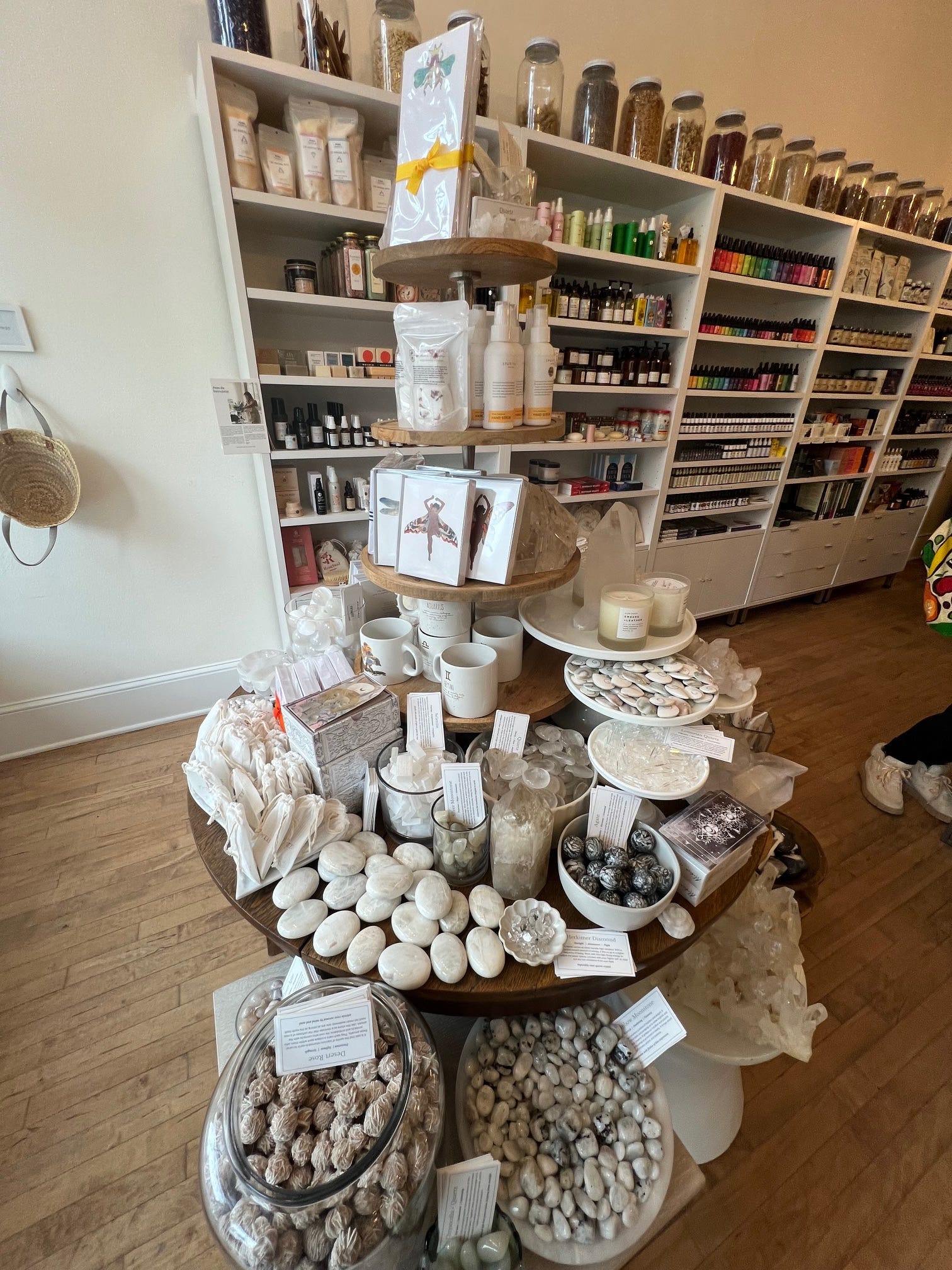
This is a broad assortment in a tight footprint, yet it never overwhelms. The restraint is the point. Every object earns its place. The result feels calm, intentional, and quietly inviting.
What stands out is how this moment works in two directions at once. It hints at the turn of the calendar toward something lighter and new, while still embracing the slower, lingering months of winter. There’s no rush here.
That same sensibility carries into the windows.
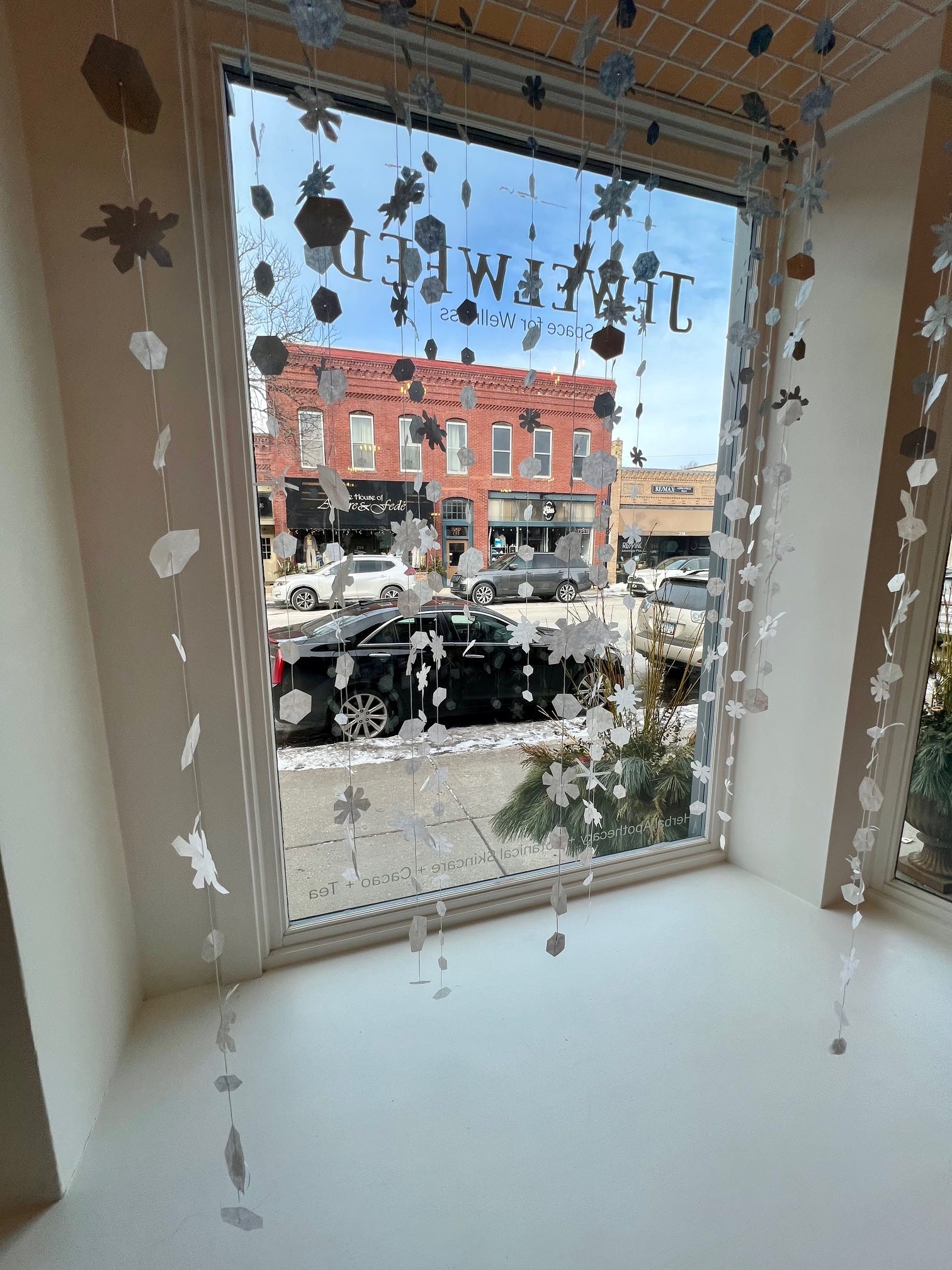
Delicate strands of hand-cut forms hang like falling snow. Light passes through them softly. It’s simple, beautiful, playful, and yes, intricate. “Simple” here doesn’t mean easy. It means disciplined.
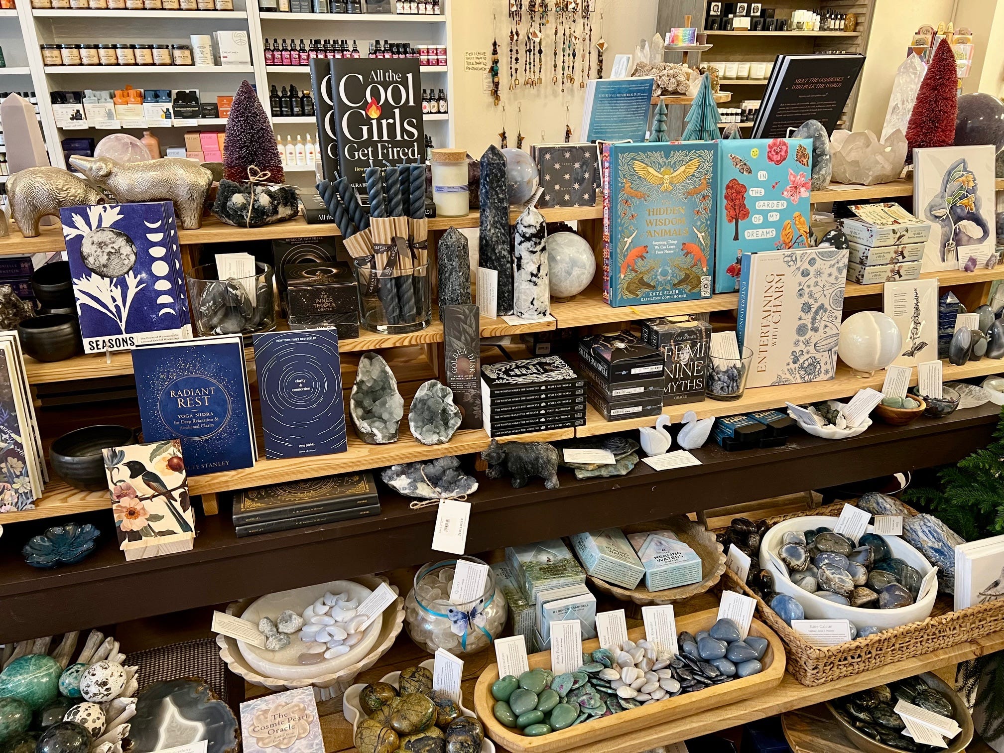
Jewelweed continues to show how color, or in this case, the absence of it, can anchor a capsule and sharpen the point of view. Yellow. Green. Blue. Black. White. Each treated as its own world, not just a seasonal swap.
What this reinforces for retailers:
• Color is a storytelling tool, not decoration
• Tight curation builds confidence, not limitation
• Quiet moments often invite longer engagement
Sometimes the most powerful move is knowing when to soften and letting the product, the light, and the space do the work.