
Intent vs. Impact
Retail Moment ● January 13

When Visual Metaphors Miss the Mark
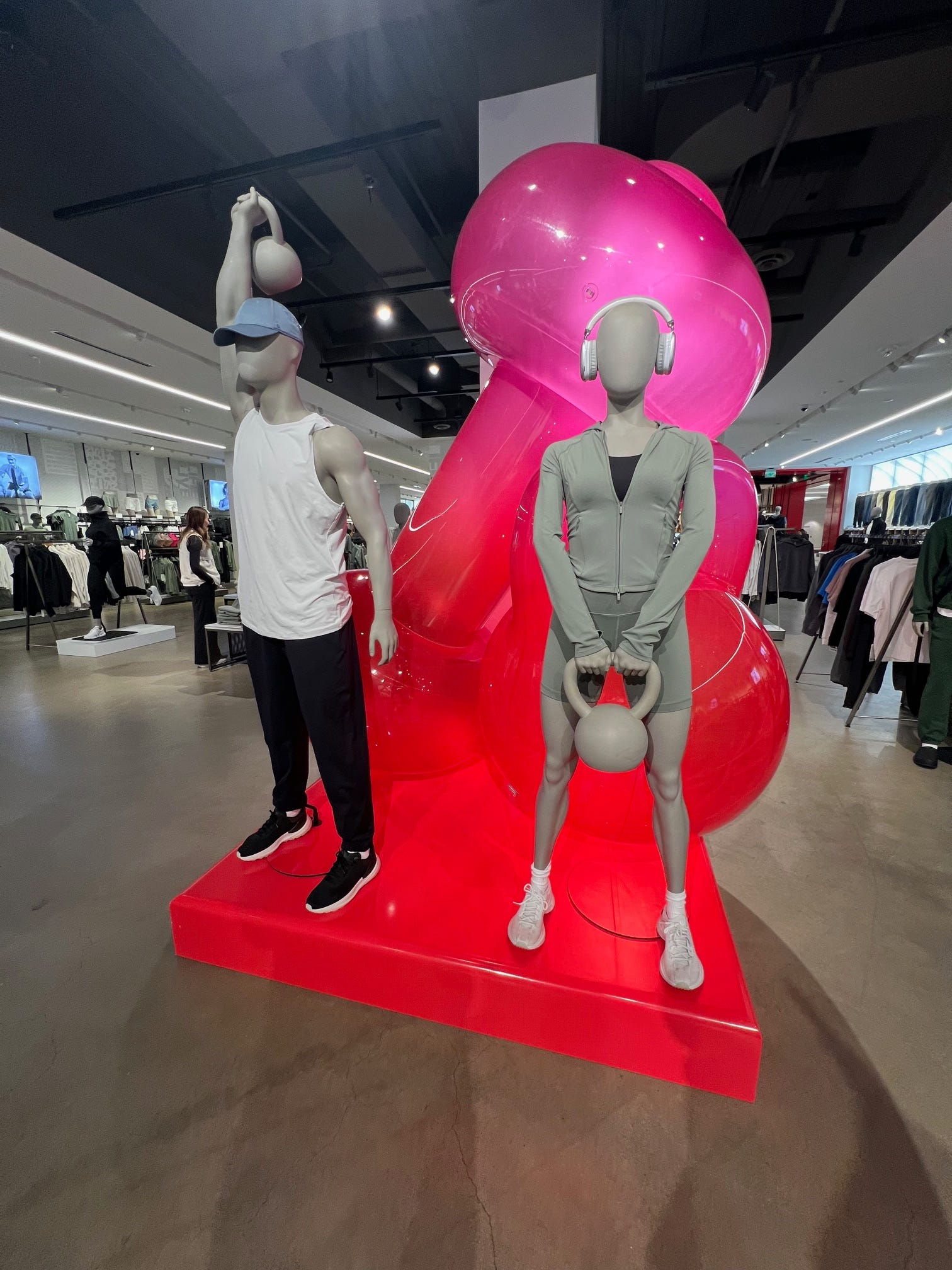
This in-store moment immediately caught my attention.
The intent is clear. New Year’s resolutions are in full swing. Valentine’s Day is approaching. Strength, wellness, and self-improvement are front of mind. The visual language leans into fitness equipment and sculptural forms meant to signal power and progress.
But intent and impact don’t always land the same way.
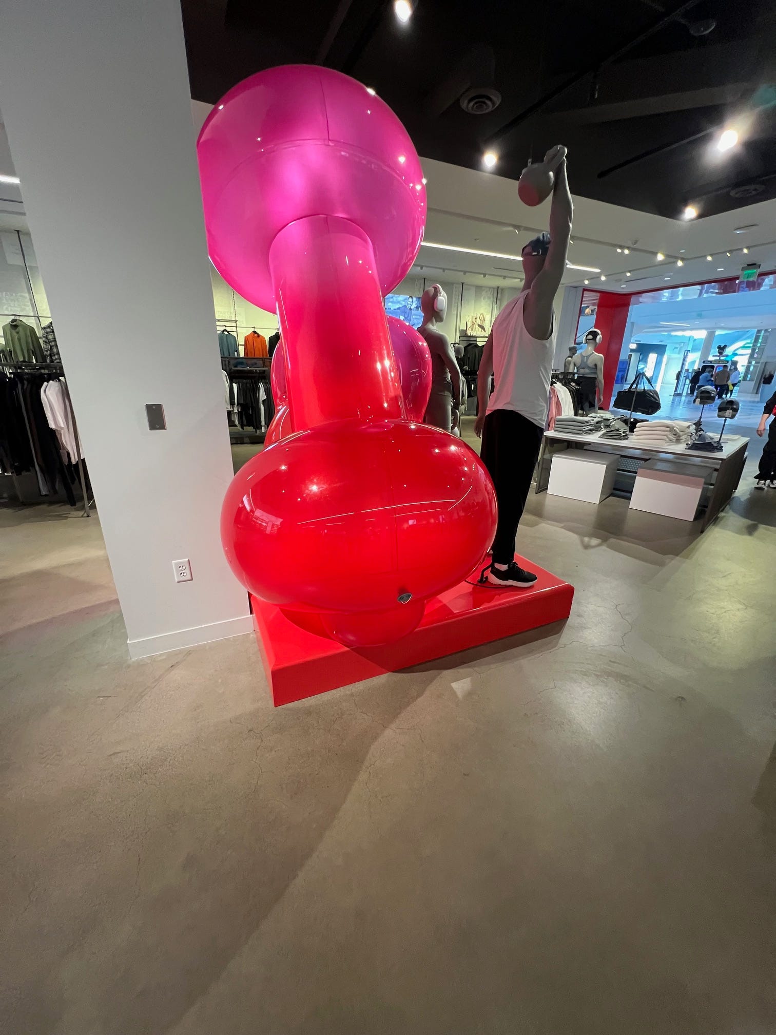
What’s interesting here is not the idea itself, but the execution.
The oversized shapes are meant to reference dumbbells and kettlebells. Abstract. Bold. Visually arresting. Yet the proportions and placement could introduce an unintended read that pulls attention away from the message they were trying to reinforce.
And that’s the risk.
When a visual metaphor becomes distracting or ambiguous, the customer stops thinking about product, performance, or aspiration and starts trying to interpret the display itself.
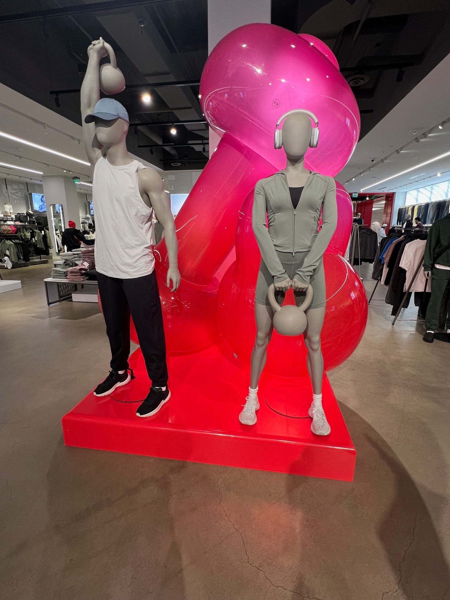
This is especially tricky in a brand environment that is usually so disciplined in form, balance, and clarity.
Strong visual merchandising doesn’t require explanation. It should reinforce the brand promise intuitively. When it doesn’t, even briefly, it creates friction in an otherwise controlled experience.
That friction may be small. But in a premium, highly intentional space, small moments matter.
Closing Thought
This display isn’t a failure. It’s a reminder.
In-store storytelling lives in inches, angles, and associations. When symbolism gets too abstract or too literal at the same time, the message can shift faster than intended.
The line between bold and distracting is thin.
💬 Curious how others read this moment.
Does it spark motivation, confusion, or conversation for you?